
Writing Actionable Content
Improving the usability and efficiency of this popular tennis app.
.png)


Tennis Record is used by 10,000+ users across North America. The app aims to make USTA data easily accessible to amateur tennis players who enjoy competing in USTA matches. It provides users with a database to research players, ratings, and tournaments.
Challenge
Many fellow tennis players complained to me about Tennis Record's functionality. I noticed an issue and hence I decided to make a change.
How might we make this app more accessible, modern and concise?
Objective
-
Design an updated user-friendly app that allows amateur tennis players to explore information on an upcoming opponent, and efficiently access comprehensive information.
-
Design an accessible update for the app to increase onboarding by giving users the tools for success, and subsequently encouraging amateur tennis players to use the site more.

Analysis for Usability
Summary of Analysis
Current Site Needs to be more:
-
Accessible
-
Purposeful
-
Conversational
-
Concise
-
Clear

Heuristic Study
An analysis of Tennis Record.

The scope of this study is to evaluate the heuristics for the welcome screen and the following three screens of tennisrecord.com. This feedback will be obtained using the UX Writer’s Checklist as a guide. OVERALL BEST PRACTICES Readable: Yes Is the text conversational, simple, and written at about a sixth-grade level? Yes it is very simple and readable. Concise: N/A Are headlines and instruction text as short and clear as possible with no repetition, redundancy, ambiguity, or unnecessary words? There are no headlines. Simple: N/A Does the text explain complex features and define terms on first use in plain language? There are no complex features to explain. Universal: Yes Does the word choice avoid technical jargon, idioms, and hard-to-translate phrases like "two peas in a pod"? The wording appears to be universal. Consistent: N/A Do text elements or UI components of the same type use parallel patterns and styles? N/A Logical: Yes Does the ongoing text across screens have a discernible narrative progression that would make sense to anyone? Yes, it seems self-explanatory. Guiding: Somewhat Is the next required action clearly stated at each screen? Yes, if not obstructed by an ad. User-focused: N/A Are user benefits & goals positively emphasized over company or product goals? N/A Holistic N/A Does the text compliment the visual layout and illustrations and vice versa? (Is the sum greater than the parts?) N/A Prioritized: Yes If you squint at any screen, is the info hierarchy clear? Do the most important actions and info stand out? Yes the most basic parts are clear. Voice, tone & terminology Empathetic: No Is the tone generally upbeat and appropriate for the users’ context and emotions at each step in the flow? There is no voice or tone. It is basic. On-brand: No Do the grammar, terminology, phrasing, and level of formality align with the company's brand voice principles? There isn’t really a brand. Besides the logo, this website does not seem to be seeking to communicate brand principles. Consistent: Somewhat Is terminology used consistently across the entire user experience including from marketing through support, between OSs and devices, and in companion products? The terminology is used consistently. Global-friendly: No Is humor or whimsy culturally appropriate and universally relevant? There is no humor. I wish there was. Reliable: Somewhat Is the speaker's point of view consistent, trustworthy, and reliable throughout the user journey with no POV switches? There is no real voice but the point of view seems consistent. Correct: Yes Have all spelling, grammar, capitalization, date and number formats been checked against the style guide? There don’t appear to be errors. Error Messages Actionable: Somewhat Does the error say what happened in simple terms and explain what the user needs to do next to get back on task? I have not encountered an error screen yet. What will most frequently happen is that the next screen will fail to load, seemingly because of a pop-up ad misfire. When this happens, I refresh the page and get the results. Compassionate: No Do the language and the tone of the message match the severity of the issue and avoid blaming the user for the error? There is no voice. Proximal: Yes Are the error messages close to the relevant field or component where the error occurred? The only error message I have encountered says “No player found.” This appears directly after entering a name in the search. Instructional text & tooltips Informative: No Do users have enough info and guidance at every point in the flow to make a decision and continue with confidence? I do not feel guided from screen to screen. It seems like they expect it to be self-explanatory. Prepared: No Do users have enough context and info about consequences before beginning a multi-step task or taking a critical action? The user feels on their own. Reassuring: No Are complex decision points (like data-sharing or purchase confirmations) addressed with enough reassuring guidance and info? No there is no guidance. Generous: N/A Do tooltips provide additional details and info for users who need help understanding or who feel anxious? Not available. Supportive: No Are users given easy paths to learn more using progressive disclosure and avoiding "dead ends" (no path to more info)? Not paths available. Notifications & Alerts Front-loaded: Somewhat Do important phrases or words appear first in the message so that its meaning is clear to users even if truncated? The most basic words appear. The meaning is not very clear. This appears to be a website in need of an upgrade. Meaningful: Somewhat Are notifications or alerts useful and relevant to the user at the moment they're presented? If the user enters a name incorrectly in the search the next screen will say no results were found. Appropriate: No Is the tone of the notification appropriate for the user’s context? There is no tone. User-focused: Somewhat Where possible, are messages prioritized based on user needs not sales, marketing, or product team needs? User messages are based on needs, except for the annoying pop-up ads. Consistent: Yes Do individual alerts and messages conform to an overall framework that uses consistent patterns for similar message types? (Should be consistent for each mode and device type) Yes there does not seem to be a difference despite device type Notifications & Alerts Front-loaded: Somewhat Do important phrases or words appear first in the message so that its meaning is clear to users even if truncated? Yes, important words such as “Player Search” appear on the very first screen. Meaningful: Somewhat Are notifications or alerts useful and relevant to the user at the moment they're presented? If a result isn’t obtained, the user will be notified with the text “No Players Found,” in bold red letters. Although usually that is after an annoying pop-up screen. Appropriate: N/A Is the tone of the notification appropriate for the user’s context? There is no tone evident. User-focused: Somewhat Where possible, are messages prioritized based on user needs not sales, marketing, or product team needs? Yes, the priority seems to be user needs, but unfortunately ads sometimes get in the way. Consistent: Yes Do individual alerts and messages conform to an overall framework that uses consistent patterns for similar message types? Yes, the alerts seem consistent. ONBOARDING (First-Use) Value-focused: Somewhat Does the text show the user how to experience the value of the product as soon as possible? There is not much of a choice except to choose your category from the onboarding screen and enter your information on the next screen. This website has no bells or whistles. User-focused: Somewhat Does the content focus on how the product will benefit users in solving their problem (and less on features or technical details)? The content is focused on solving the problem of providing tennis results to the user. However, the multiple pop-up ads are disruptive and even distracting often, even obscuring the link the user is trying to reach at times. Cohesive: No Do the stated product benefits match the major selling points promised in marketing materials? There are no marketing materials provided. There is no tagline or promotional material on the onboarding screen. Necessary: Somewhat Do the initial screens convey only the essential info needed to inspire action and avoid any info not meaningful to first-time users? The initial screens only display essential information. I would not say they inspire action, but the basics are there. However, there is some confusing wording in the description accompanying the “College Search.” It would be improved by saying “Players by College” and remove the blurb next to it. Reassuring: Somewhat Does the onboarding content answer the user's most pressing questions and remove mystery or doubt on first use? The user gets to where they want to go. However, there does not appear to be much help available if the user has a question. Respectful: No Before asking users to give access to data or grant permissions, are the reasons it's necessary and the benefits to the user explained? The website does not ask for permission to use information. The user enters basic information to get more detailed information about themselves or another player. Dialogs / Modals Direct: Yes Does the headline ask a single, clear question or communicate a single concise message? The website name “Tennis Record” clearly appears up top. Distinct: No Does the primary button text state an unambiguous action and indicate what happens on-click? There is no button. Explanatory: No Does the body text clarify any consequences and explain options in simple terms? There are no consequences needing an explanation. If you enter the name wrong, no results will be given. Maybe a remedy to this would be suggestions instead of a screen that says, “No Players Found.” Dashboards Apparent: Somewhat Is the info presented with appropriate visual emphasis so that important statistics, charts, and recommended actions stand out? Yes, the basic information stands out with bold letters and different text colors. But the pop-up ads get in the way. Grouped: Yes Is the data clearly and logically grouped and labeled? Yes Intuitive: Yes Is it easy for novice and advanced users alike to interpret data visualizations based on the headings, labels, and captions? Yes Inclusive: No Are complex concepts or industry terms explained with tooltips or linked help articles for unfamiliar users? No there are no tooltips or linked help. Prioritized: No Is it clear which dashboard actions are mandatory, recommended, or strictly optional? No this is unclear. Everything seems to have equal weight. Evident: No Are the sources of aggregated data accessible to users who want to explore details or better understand impact at the source? This is not available to the user. Empty States Positive: Yes Does the message focus on user benefit and encourage progress toward a user goal? The website is focused purely on helping the user find statistics. Explicit: No Does the text explain exactly what action the user can take to fill the empty state? No there is no explanation. Holistic: No Do the images and messaging complement each other and meet brand and tone guidelines? There is no brand or tone. Indicative: No Does the empty state provide the user with an indication of the data, info, or visual that will eventually occupy the space? No there is no indication. Forms Logical: Somewhat Are similar fields grouped together into sections? Similar fields do seem to be grouped together. Clear: Somewhat Are fields and sections clearly and consistently labeled in language that's easy for anyone to understand? It seems self-explanatory…no labels help ease the user’s understanding. Unique: No Viewed together as pairs, do the field labels and hint text avoid redundancy and serve separate, unique purposes? The website is very redundant in how information is displayed. Helpful: No Does hint text prevent errors by providing an example or instructions for complex formatting? There is no hint text. Proactive: No Are tooltips added next to any field label where users need more info or reassurance? There are no tooltips provided. Validating: No Are field and data validation errors meaningfully focused on guiding users and correcting inputs? No, there does not seem to be much guidance or thought put into meaningfully focusing errors. Transactional Emails Front-loaded: Somewhat Is the most important idea or required action obvious from the main email heading? The heading says “Tennis Record.” Which seems self-explanatory but there is no tagline or supporting verbiage. Pertinent: Yes Does the email content get directly to the point? Is it obvious what the user needs to do and how they need to respond? Yes, the content gets right to the point with the search boxes. Essential: Somewhat Is every sentence of the body text necessary and is every bit of info meaningful to users? It depends on what I am looking for. I do not care about college players right now, so I won’t be using that search area. Concise: Yes Is the subject line short (about 40 characters) and is any required action or urgency clear to users? Yes, it is concise and to the point. Friendly: No Is the tone of the email content respectful, easy to understand, positive and solution-oriented? There is no tone. Readable: N/A Is the body text short and scannable with useful subheadings? There is no body text. Actionable: No Are step-by-step instructions thorough and clear? Is the CTA easy to find and positioned near the top of the email? There are no step-by-step instructions. Consistent: N/A Do the terms in the email match those used in the interface, in the support content or articles, and those preferred by users? Email N/A. Informative N/A Does the email tell users how to get more info, share feedback, or contact someone for more help? Email N/A.
Analysis of Landing Page text
-
The person is not logging in here. He or she needs to select one of the categories below to search for tennis statistics.
-
What does “College Search” mean? Confusing.
-
Not concise: Sentences blurbs are too long and my eyes glaze over them. Especially the description for “Tournament Registrations.”
-
The bottom ad is nearly obscuring the category I personally need to click on, “Player Search.” How annoying!
Recommendation
Change about 8 strings in total, with a few layout changes needed for clarity.
-
The interactive text needs to be cleaned up. Remove confusing pop-up ad at top of screen that asks user to input information for to Search People, much like a spam message. (I think I actually did this once when I was new to the site grrr.
-
Reduce content by making descriptions more concise
-
Make a header that makes the site feel more fun, like, “Welcome to TennisRecord. The premiere site for sizing up fellow players.”
-
Remove “Submit” language - it reduces usability and accessibility

Building User Empathy
The heuristic study and interviewing fellow tennis players who use Tennis Record daily gave me a better understanding of who the users are and how they might use the app. I expanded those visualizations into a visualization that would help me develop the necessary upgrades.
Creating a User Persona

The 5 W's
Next, the 5 W's are flushed out.

The current user story is laid out.
User Story

An alternative story is explored.
Alternative User Story

Voice
Next the current voice is analyzed and a voice chart is created.
Summary of Analysis
-
Concepts: The initial screen uses many words and options.
-
Vocabulary: Descriptions are plain.
-
Verbosity: No jokes. Complete sentences are used.
-
Grammar: Gender neutral. Complete sentences are used.
-
Punctuation: On point.
-
Capitalization: Everything has equal weight.

Voice Recommendations
A new voice chart is created.
Summary of Recommendations
-
Concepts: The initial screen is overwhelming. It must be simplified to convey efficiency. A simple "Player Search" button would convey accessibility. And an addition of a photo of fellow amateur players would convey a level of trust.
-
Vocabulary: Simplify all descriptions on the homepage into two sentences.
-
Verbosity: Tennis jargon should be used to lighten things up. "Love All" is a simple way to do that.
-
Grammar: Gender neutral. Multiple sentence blocks have been simplified.
-
Punctuation: On point.
-
Capitalization: On the second screen, "Player Search" should stand out more as a title. Title-case, headings and buttons should be used.

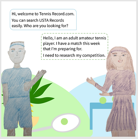
Conversation as a Design
Here's how the conversation would work if the experience was a person.
Wireframing
What the conversation looks like as a set of screens.

Measuring the Impact
Now I measured the impact of the changes, first using a qualitative evaluation, and then a quantitative scorecard. I tested the prototype with a few users and noticed that the improvements were well recieved. Users were able to find their information 75% faster.
To recap, the customer goals were:
-
Be able to easily find statistics
-
Use the statistics to prepare for upcoming matches
Business goals:
-
Create an efficient, easy, trustworthy experience for players
-
Streamline the experience of locating player data so there is less time spent looking up statistics and more time spent on court
Qualitative evaluation


Quantitative Impact

Timeline

.png)


