
App Redesign
Crises app designed to alert users of weather emergencies.
.png)
Emergency, by the American Red Cross, allows users to monitor the people and places they care about most during a natural disaster.
Challenge
The idea to revamp the Emergency App evolved from discussing the app in a UW UX class with other students. While the emergency information is accessible, the site design is not intuitive.
How might we make this app more accessible, modern and concise?
Objective
-
Design an updated user-friendly app that allows users to access emergency information quickly
-
Design an accessible update for the app to so that users can monitor loved ones in times of crises and give or get aid quickly.

Conversation as a Design
Here's how the conversation would work if the experience was a person.

Wireframing
What the conversation looks like as a set of screens.

Measuring the Impact
Now I measured the impact of the changes, first using a qualitative evaluation, and then a quantitative scorecard.
To recap, the customer goals were:
-
A person worried about natural disasters wants to be notified of an emergency, in order to get and give aid to loved ones.
Business goals:
-
Provide emergency information about disasters clearly and quickly.


Project Reflections
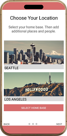
I had empathy for users of this app who would be caught off-guard in an emergency situation. I was struck by the feeling of helplessness I would feel if I couldn't reach a loved one out of state, during a natural disaster. Because of this I felt adding a stock photo of actual Red Cross workers in the field would humanize the app. Cutting out the fat, as I like to call it, was also key here, because in moments of stress and disaster, the last thing a user wants to do is read a novel-length paragraph. They need pertinent info immediately. I liked the using terminology "live updates" to address this need. Lastly, I preferred "Choose Your Location" instead of "Add a Place" to personalize the app.

.png)
.png)